How to Design Effective Posters with Modular Grids
Learn how to design clear posters using visual hierarchy, modular grids, and color harmony.
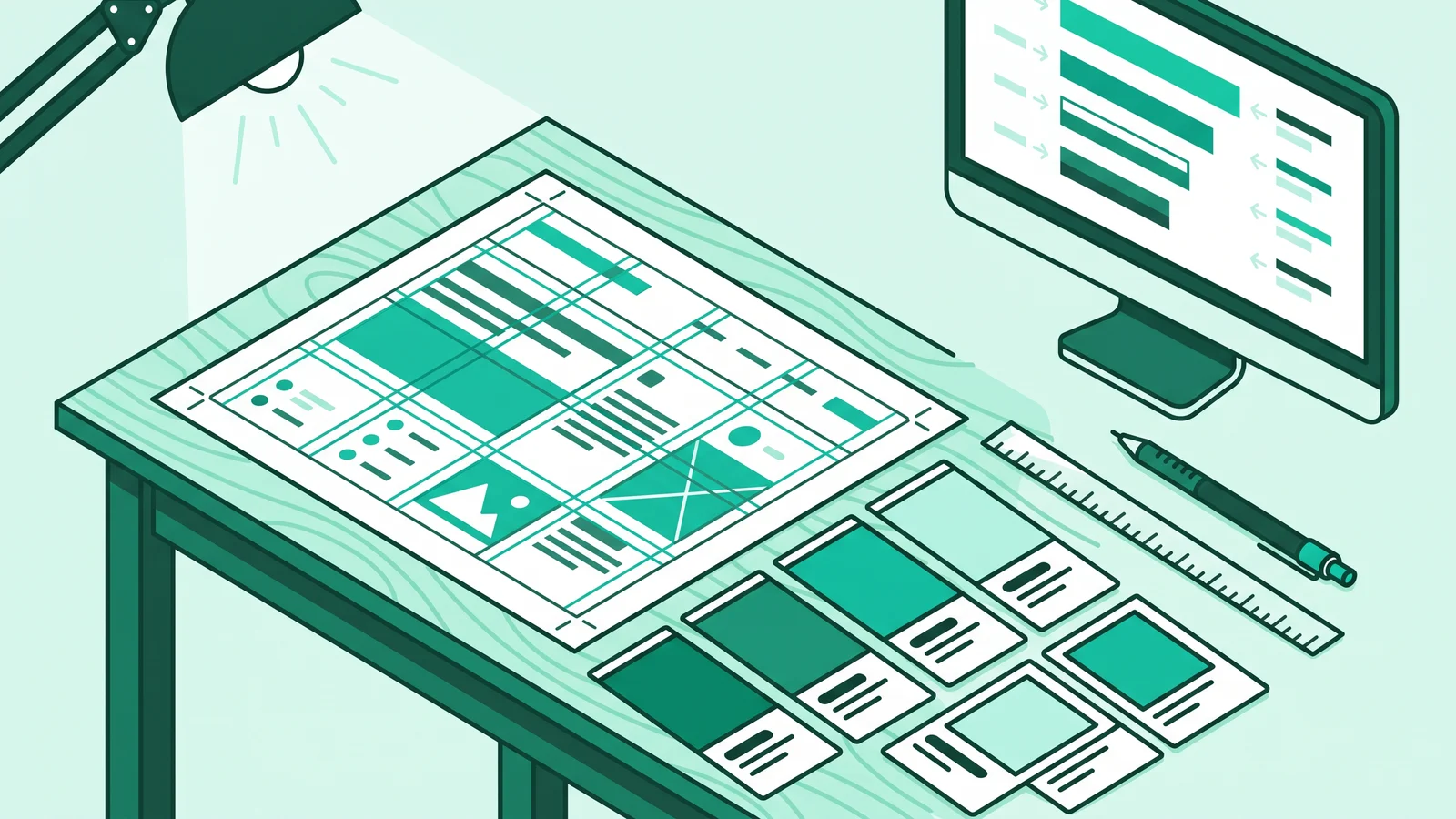
Understanding how to make a poster effectively requires applying a three-tier visual hierarchy, a modular grid system, and color contrast that meets accessibility standards. A functional poster does not rely on heavy decoration. Instead, it directs the audience's visual path in milliseconds from the main headline to the core information and the Call to Action.
Many people think poster design is just a matter of artistic taste. As a practitioner who designs educational materials for schools and builds web interfaces, I look at posters from a different perspective. A poster is a piece of visual communication engineering.
When a teacher pins an announcement on the school noticeboard or a designer posts event details on social media, they compete for incredibly short human attention. Without a measured structure, even the most important information will sink into visual clutter that passersby ignore.
Why Do People Ignore Posters? The Science Behind Visual Perception
The human brain processes images much faster than sentences. Neuroscience research from the Massachusetts Institute of Technology (MIT) in 2014 proved that the human brain can identify visual images in just 13 milliseconds.
A visual perception study by Lindgaard et al. (2006) supports this finding: humans form an aesthetic impression and judge initial layout order in just 50 milliseconds. This means your audience decides to read or ignore your poster before they can even spell out a single word.
This perception speed gave rise to an objective approach in visual communication design. Allen Hurlburt, in his book Grid: A Modular System for the Design and Production of Newspapers, Magazines and Books, introduced the concept of graphic engineering. This approach treats design not as a freeform painting canvas, but as a mathematical module system that assembles text and images to communicate data efficiently.
Similarly, Josef Müller-Brockmann stated in Grid Systems in Graphic Design that typographic order and grid-based spacing help readers absorb information logically. The organizational principles of the Bauhaus movement and Swiss style design serve as the main foundation for both modern poster design and today's digital interfaces.
Visual Engineering Foundation: 4 Graphic Design Principles for Posters
Before opening any design app, you need to master four technical pillars of graphic design principles for visual layouts. These four principles ensure your poster works functionally from any viewing distance.

1. The 3-Tier Visual Hierarchy Formula
Never give all your text the same size weight. Divide the information in your poster into three priority levels:
- First Tier (Primary / Hook): The main focal point, such as a short headline or dominant illustration. This element must stop people in their tracks from 3 to 5 meters away.
- Second Tier (Secondary / Body): Explanatory information answering the what, when, and where. This section includes subheadings, event dates, times, and speaker names.
- Third Tier (Tertiary / Details): Technical details and the Call to Action. Place registration links, QR codes, ticket prices, and a row of sponsor logos in this area using the smallest legible size.
2. Modular Grid Systems and Gestalt's Law of Proximity
The most fatal layout mistake is scattering text elements randomly across the canvas. Divide your workspace into imaginary columns and rows to create visual unity.
Conrad Bohnke, in From Zero to UIUX Hero, suggests a modular spacing system based on a consistent multiple (like an 8-pixel grid for digital documents) to keep proportional distances between elements (gutters) and edges (margins). This spacing directly relates to the Law of Proximity in Gestalt psychology. Group text elements that share a logical connection, like a speaker's name and their job title, and put more distance between them and other information blocks, like the event location.
3. Functional Typography and Contrast Scaling
Namuri Migotuwio's book Desain Grafis Kemarin, Kini, dan Nanti discusses how the New Typography movement pioneered clean, geometric sans-serif typefaces free of ornaments. These letters use imaginary space efficiently and maintain high readability on both device screens and physical prints.
Apply a rule of maximum two typefaces per poster. Pair one strong-character font for the main headline (like bold Inter, Syne, or Helvetica) with one high-legibility font for detail text. Use contrasting size scale ratios, such as a 3:1 ratio between the headline and subheading, so the reader's eyes instantly catch the reading order.
4. The 60-30-10 Color Palette and WCAG Accessibility Standards
Choosing colors is not just about finding an attractive combination; it is about maintaining visibility. Use the 60-30-10 proportion formula from color theory in visual arts through the HSL (Hue, Saturation, Lightness) model:
- 60% Dominant Color: The base or neutral color acts as the primary background to soothe the eyes.
- 30% Structural Color: A secondary color to distinguish information cards, grid boxes, or subheadings.
- 10% Accent Color: The color with the most striking saturation and contrast, specifically directed at the call-to-action buttons or event dates.
As a web developer, I always apply digital accessibility standards from WCAG (Web Content Accessibility Guidelines) 2.1/2.2 level AA to both physical and digital poster designs. Ensure the luminance contrast ratio between text and background color reaches at least 4.5:1 for normal text, and at least 3:1 for large headline text (above 18pt bold or 24px). Measured contrast ensures your poster remains clearly readable for audiences with partial color blindness or people reading it under bright sunlight.
The 3-Second Squint Test: Before exporting your poster draft, zoom out your canvas to 20% or squint your eyes until your vision blurs. If you cannot immediately tell the difference between the main headline and supporting text within 3 seconds in this blurred state, your hierarchy and contrast are not working. Enlarge the headline or darken the background color.
Standard Technical Specifications Table for Posters (Print vs. Digital)
Many designs that look sharp on a laptop screen become blurry or cut off when sent to the printer. Set your document parameters early based on these distribution mediums:
Practical Guide on How to Make a Poster Across Devices
After understanding the theoretical foundation and canvas specifications, it is time to execute how to make a poster using the methods and tools that best fit your workflow.
1. The Compartment Method for Beginners (Bento Grid Trend)
If you are not used to arranging compositions from a blank canvas, try the Bento Grid or Neo-Brutalism layout trends popular around 2025–2026. Neo-Brutalism relies on bold sans-serif typography, high-contrast borders, and solid colors without excessive gradients.
Meanwhile, the Bento Grid divides your poster canvas into square or rectangular compartment modules with rounded corners, much like a Japanese lunchbox. You simply insert one type of information into each box: a large module at the top for the headline and main visuals, a bottom-left module for time and location, and a bottom-right module with a contrasting accent color for the registration QR code. This compartmentalized approach automatically prevents text from overlapping and forms a neat grid structure right away.
2. How to Make a Poster in Canva (Web and Desktop)
Canva and its Canva Magic Studio suite now support automated layout arrangements via an AI Layout Generator. However, to keep your results precise and functional, follow these structural steps:
Prepare Canvas Dimensions and Guides
Click the Create a Design button, then type poster dimensions like "A3 Print Poster" or a custom pixel size. Open File > Settings, then enable Show rulers and guides and Show margins. Drag a ruler from the edge of the canvas to create modular boundaries for your 3-tier hierarchy.
Build a Background with Controlled Contrast
Add a solid background color following the 60% rule. If you must use a photo as a background, add a scrim layer in the form of a dark, transparent color block over the photo. This step ensures the text on top still meets the standard WCAG contrast ratios.
Separate the Three Main Text Blocks
Create three separate text blocks for your Headline, Body, and Footer/CTA using a maximum of two consistent fonts. Avoid combining all your copy into a single text box, as it will make adjusting the distance between information groups difficult.
Align Elements Using the Align Feature
Select your text elements, click the Position menu in the top bar, and use the Align feature to keep axis lines tidy. Left-aligned text is much easier for human eyes to scan for information compared to center-aligned text from top to bottom.
Export According to the Target Distribution
Click the Share > Download button. Choose PDF Print format with the CMYK color profile option and crop marks and bleed for print posters. Choose PNG or JPG at maximum quality for online publication.
3. How to Make a Poster with AI (Hybrid Workflow)
AI-based image generators like Ideogram AI, Adobe Firefly, and Midjourney v6/v7 have massively improved at rendering spelling-accurate typography. Even so, relying entirely on AI to create a finished poster still risks generating detail text that prints blurry.
The best solution is a hybrid workflow: use AI specifically to create base artwork that provides empty space, then complete the typographic arrangement manually in a design app.
When writing prompts in an image generator, specifically ask for a design style and negative space for text placement. A proven example prompt: "Swiss design exhibition poster background, minimalist geometric shapes, bauhaus color palette (navy blue, cream, orange accent), generous negative space at top half for text, flat vector style, no messy text, 8k --ar 2:3"
After the AI generates the base visual:
- Bring the image into your workspace canvas in Canva or Figma.
- Place the main headline text block right in the negative space on the upper half of the image.
- Type the date, location, and contact information manually using the app's native vector fonts so the edges of the letters remain sharp when printed.
4. How to Make a Poster on a Phone for Quick Needs
Designing a poster on a smartphone screen via Canva or Adobe Express Mobile often faces the challenge of a narrow field of view. Our fingers easily shift elements by accident.
To maintain precision on a small screen, use the Snap Alignment feature (the purple magnetic guidelines that appear automatically when you drag an object with your finger). These lines ensure the element sits right on the vertical axis or lines up straight with other objects.
Also, apply the Finger Margin rule: leave empty space around the screen border covering at least 10% to 15% of the canvas width. This safe space prevents important information from getting cropped or covered by app interfaces when you share the poster on social media.
4 Common Poster Design Mistakes and Their Solutions
Many poster creators fall into visual habits that actually obscure their main message. Avoid these four classic mistakes when building your composition:
1. Fear of Empty Space (Horror Vacui) Filling every corner of your poster with illustrations, stickers, or long text will make the design look cluttered and trigger cognitive fatigue. Conrad Bohnke and Namuri Migotuwio both emphasize that empty space (whitespace or negative space) is not wasted area; it is an active element that gives visual pauses and highlights primary elements.
- 2. Ignoring the Law of Proximity (Proximity Failure) Giving equal spacing between information categories makes it hard for audiences to tell apart speaker names, dates, or locations. The solution is to group logically related elements closer together and provide wider gaps between different topic groups.
- 3. Contrast Ratio Violations (Figure-Ground Confusion) Placing bright text directly over a photo background with mixed light and dark areas will cause some letters to vanish into the background. Use solid color blocks, bounding boxes (Bento or Neo-brutalist style), or lower the background image contrast so the front object (figure) and background (ground) separate cleanly.
- 4. Using More Than Three Typefaces (Font Chaos) Mixing decorative, serif, and script fonts on a single canvas ruins readability. Limit your typeface use to a maximum of 2 fonts, then vary the hierarchy simply by changing weight (Bold vs Regular) and size scale.
Frequently Asked Questions (FAQ)
Start by defining a 3-tier information hierarchy (Headline, Time/Location, Contact), use a simple compartment grid system (Bento Grid), and limit your palette to a maximum of 3 main colors (the 60-30-10 rule). You can also use structural templates in Canva by just changing the content without altering the base layout.
For print media, standard sizes are A3 (29.7 × 42 cm) or A2 (42 × 59.4 cm) with a minimum resolution of 300 DPI and CMYK color mode. For digital media, use 1080 × 1920 pixels (9:16 ratio for full vertical screens) or 1080 × 1350 pixels (4:5 ratio for portrait feeds) with an RGB color profile.
Posters look pixelated when printed because the document uses low-resolution screen pixels (like 72 DPI) or exports as a highly compressed image file (standard JPG). Make sure to export your document to a high-resolution print format (PDF Print / Vector PDF) at 300 DPI.
Generative AI is highly effective at producing concept ideas, background visuals, and color palettes. However, to arrange hierarchical text, contact numbers, and precise information layouts, you still need to set the typography manually in a design app to maintain legibility and information accuracy.