Complete UI UX Design Guide from Concepts to Workflow
Master the foundations of UI UX design, workflow stages, user research, and interface systems.
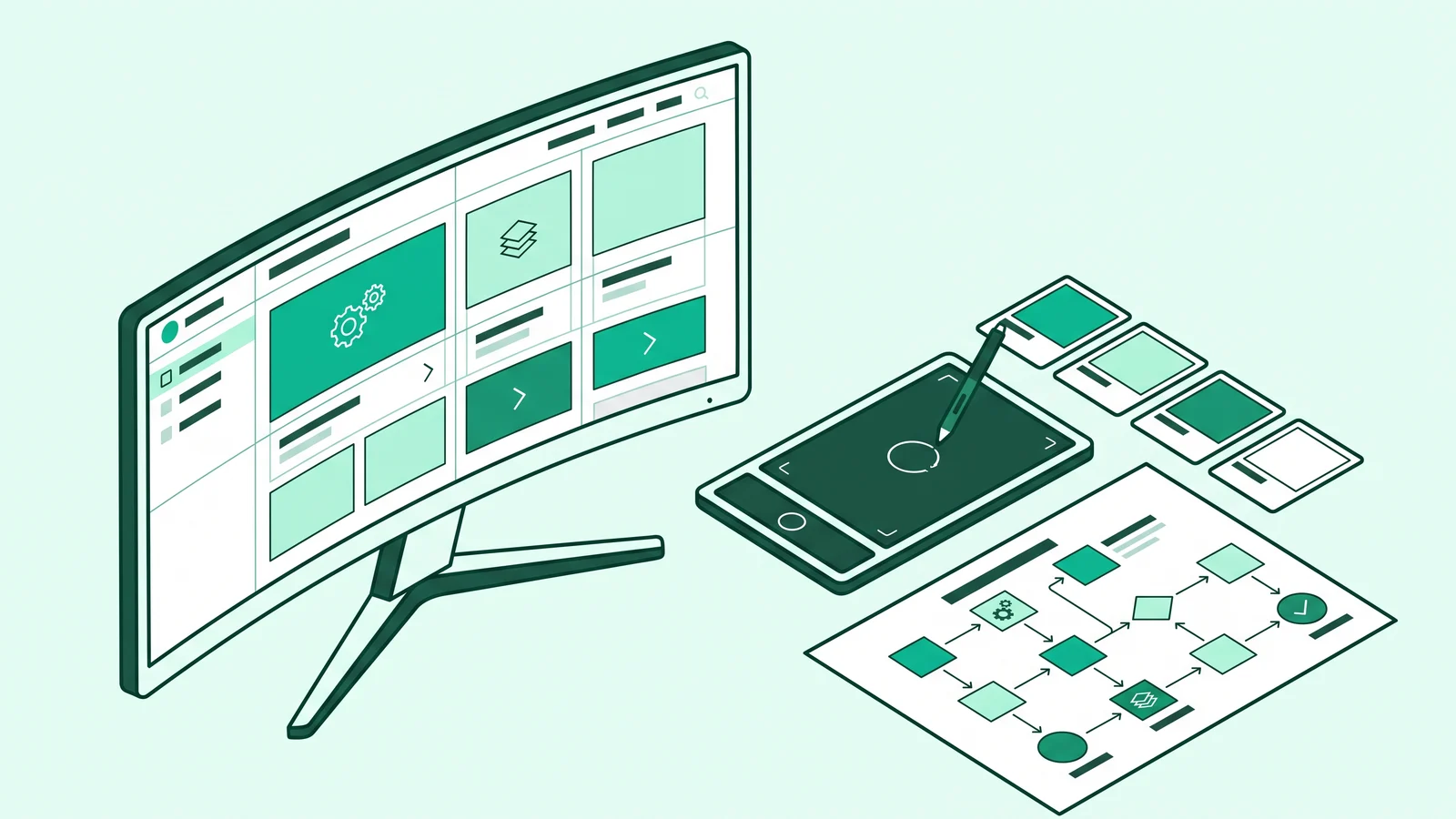
UI/UX design is a digital product discipline combining user experience architecture with visual-interactive user interface elements. This discipline aligns navigation logic, cognitive psychology, and visual hierarchy so applications or websites work functionally, efficiently, and provide a satisfying experience for humans.
Many product teams still equate interface design with merely decorating screens. As a result, thousands of applications look stunning in social media portfolios but fail completely when real users struggle to find a confirmation button.
As a practitioner who designs interface systems and writes frontend code, I see the line between visual design and software engineering getting thinner. Decisions about color, element spacing, and data structure must rely on how the human brain works and the technical capabilities of web browsers.
Breaking Down the Foundations of UI/UX Design and the Practitioner's Role
The book The Graphic Design Reference & Specification Book positions interface and user experience design as a functional bridge between business goals and human needs. These two terms always go together, but each carries specific responsibilities.
User Experience (UX) covers the entire process, emotions, and ease a person experiences when interacting with a digital product. Dario Benevento in Frontend Development (UIUX & Psychology) emphasizes that UX relies on information architecture, cognitive psychology, user flow mapping, and functional problem solving.
Meanwhile, User Interface (UI) is the visual meeting point and operational medium between humans and machines. UI governs typography choices, color palettes, layouts, interactive components (buttons, form fields, information cards), and micro-interactions that guide the user's eyes across the screen.
UI design without UX research will produce a cosmetically beautiful but confusing product that users will abandon. Conversely, solid UX architecture without mature UI execution will yield a functional application that strains the eyes and is hard to navigate.
Behind the scenes, a UI/UX designer is responsible for researching user needs, designing structural frameworks, establishing visual languages, and testing product usability before handing it over to the development team. Referring to the competency structure in the Kominfo DTS 2024 UI-UX Designer Syllabus, this role demands empathetic sensitivity and sharp system logic. For those who want to understand this profession's specific competency map, please read the career guide for UI/UX designers.
UI/UX Design Workflow from Research to Handoff
Designing robust digital products requires a measured workflow. Skipping the structure phase to chase visuals is the fastest recipe for endless revisions.
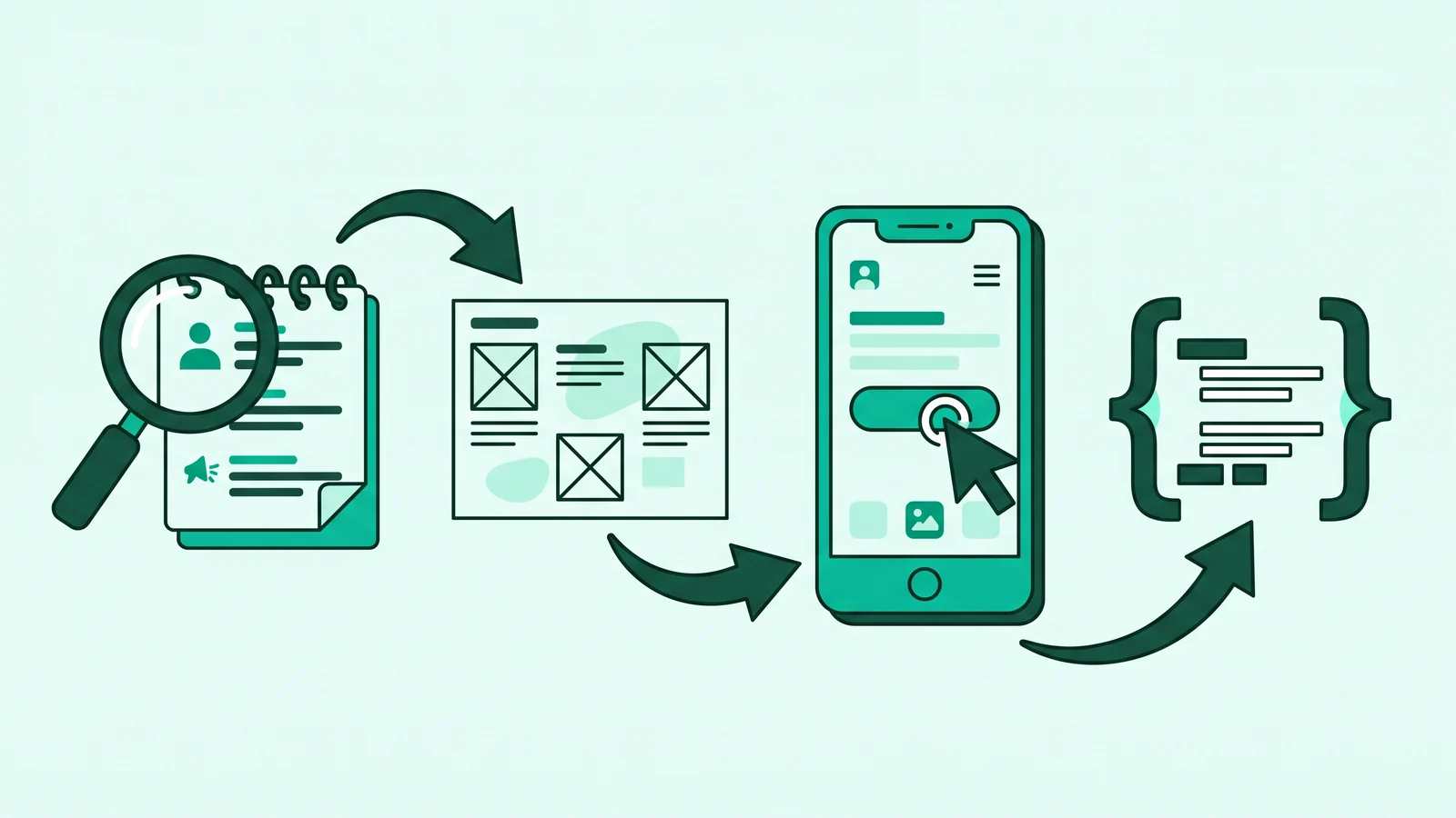
Discovery and User Research
The design process always starts by exploring problems, not internal team assumptions. Designers conduct qualitative research (in-depth interviews and direct observations) and quantitative research to map user behavior. Conrad Bohnke in From Zero to UIUX Hero explains that these research findings are then summarized into user personas, empathy maps, and user journey mapping as a compass for feature decisions.
Information Architecture and Wireframing
Once problems are mapped, designers organize content taxonomy using Card Sorting. This information structure is then translated into low-fidelity wireframes on paper or a monochrome digital canvas. Wireframes act as an architectural blueprint to lock in navigation layouts, text hierarchy, and button positions without color or image distractions.
UI Design and Design System Creation
In the high-fidelity stage, the rough framework receives a visual identity. Designers build a modular Design System containing color scales, typography, spacing rules based on an 8pt grid, shadow elevation, and component state variations (default, hover, pressed, disabled). All these visual values are bound using Design Tokens to align with the frontend developer's code variables.
Interactive Prototyping
Designers connect static screens on the canvas into dynamic simulations using interaction triggers, smart animate transitions, and overlays. This prototype allows stakeholders and potential users to experience the page transition flow as if the application were fully coded.
Usability Testing and Iteration
The assembled prototype must be tested directly on 5 to 8 participants representing the target users, as Alina Wheeler recommends in Designing Brand Identity. Designers also run Heuristic Evaluations to catch navigation friction, fix confusing flows, and hand off the final specifications to the software engineering team.
Cognitive Psychology Principles and Gestalt Laws in Interfaces
A good interface respects human working memory capacity (cognitive load theory). Dario Benevento explains that every decorative element without a clear function drains the user's brain energy when processing core information.
To keep cognitive load low, we need to apply design psychology laws. Jon Yablonski in his book Laws of UX formulates three vital laws every product designer must follow:
- Jakob's Law: Users spend most of their time on other people's apps. They expect your site or app to work with navigation patterns they already know. Do not move the shopping cart or change standard menu icons just to look artistic.
- Hick's Law: The time it takes for a human to make a decision increases with the number and complexity of choices. Trim down options shown on the screen using progressive disclosure (displaying information gradually as needed).
- Fitts's Law: The time to reach a target depends on the distance and size of the target. Primary call to action (CTA) buttons on mobile screens must be proportionally sized and placed within the natural thumb zone.
Besides these three laws, arranging components on a canvas follows Gestalt psychology principles to build fundamental graphic design principles. Two Gestalt laws that frequently operate in digital interfaces are the Law of Proximity and the Law of Common Region.
The Law of Proximity states that the brain perceives elements placed close together as one functional group. As a practical example, a form field's text label must be closer to its input box (e.g., 4px or 8px) than to the form field above it (e.g., 16px or 24px). Meanwhile, the Law of Common Region asserts that elements enclosed within the same visual boundary, such as a card component, are automatically considered logically related by users.
HSL Color Theory, Typography, and WCAG 2.2 Accessibility Standards
Visual beauty means nothing if users fail to read the information inside it. The 2026 WebAIM Million report reveals that 83.9% of the top one million website homepages globally still fail to meet minimum text color contrast standards. This massive failure occurs because many designers sacrifice readability for the aesthetic trend of thin gray text on a white background.
WCAG 2.2 Accessibility Standards
Accessibility is not an add-on feature before a product launch, but a basic infrastructure that helps all users, including those staring at mobile screens under the blazing sun. The W3C Consortium through WCAG 2.2 guidelines sets measurable parameters we must follow in UI/UX design:
- Normal Text Contrast: Text under 18pt (or under 14pt bold / 18.66px) must have a minimum contrast ratio of 4.5:1 against its background (Level AA).
- Large Text Contrast: Text ≥ 18pt (or ≥ 14pt bold) must meet a minimum contrast ratio of 3:1.
- Interactive and Non-Text Components: Input borders, buttons, toggles, and focus rings must have a minimum contrast of 3:1 against their surrounding colors.
- Touch Target Size: The Target Size Minimum criteria in WCAG 2.2 requires the click or touch area of interactive components to be at least 24 x 24 pixels to be friendly for users with motor limitations.
Avoid the Low-Contrast Trap, like using a light gray color code (#999999) on a pure white background (#FFFFFF) for caption text. Always run an automatic contrast checker plugin in your design canvas to ensure regular text contrast ratios never drop below 4.5:1.
HSL Color System and the 60-30-10 Rule
When assembling a Design System, abandon the habit of picking colors randomly via HEX codes. Use the HSL (Hue, Saturation, Lightness) color model. By locking the Hue and Saturation values, you can mathematically build a series of color gradations (tints and shades) from a 100 to 900 scale simply by sliding the Lightness percentage. A deep understanding of color theory in visual arts will heavily speed up this palette calibration process.
To keep the screen composition balanced and prevent eye strain, apply the 60-30-10 color distribution rule:
- 60% Dominant Color: The main background area and whitespace use light or dark neutral colors.
- 30% Secondary Color: Information card areas, navigation bars, and structural dividers.
- 10% Accent Color: Exclusively for primary action buttons (CTA), active links, and important status markers to instantly draw the eye's focus.
Modular Scale Typography
For web typography, set the body text size to a minimum of 16px (1rem) with an ideal line-height of 1.5x (150%). Limit the line length of sentences to a range of 60 to 80 characters per line so the reader's eyes do not lose track when moving to the next line. Build subtitle sizes using harmonious modular scale ratios, such as Major Second (1.125 multiplier) or Minor Third (1.2 multiplier).
Bridging Design and Code Through Design Tokens
One of the biggest frictions in the tech industry happens during the handoff process from designers to frontend developers. Designers often hand over messy canvases without Auto Layout rules, while developers struggle to translate static pixel values into responsive web layouts.
The most effective way to unify design and engineering languages is to apply Design Tokens. Instead of handing over raw color codes like #2563EB to programmers, we wrap those values into semantic naming based on their function, such as color-action-primary.
Here is an example of Design Tokens implementation in a modern CSS file that combines the HSL color palette, modular typography scale, and WCAG 2.2 touch target standards:

With the token structure above, when a product needs a theme adjustment or the addition of a dark mode, both designers in Figma and developers in production code simply change the values in the semantic tokens without having to dismantle hundreds of components one by one.
The Evolution of AI in UI/UX Design and Modern Interface Trends
Entering the 2025 to 2026 period, the product design landscape moves very quickly. The integration of artificial intelligence in UI/UX design now merges generative models and predictive algorithms into daily workflows and into the final products used by consumers.
In the realm of work software like Figma AI, the First Draft feature can assemble layout frameworks (editable mockups) directly from natural language text instructions. The presence of Figma Make, which bridges functional code-based prototypes, combined with automation like Smart Layer Renaming and AI content replacement, drastically cuts down repetitive technical working time.
Do not get caught in the Prompt-and-Pray pattern (asking AI to create a design and handing it straight to the client without evaluation). Treat AI tools as early exploration assistants. Information architecture decisions, empathy for local user contexts, and accessibility validation remain under your curation control.
This ease of automation shifts the practitioner's role from merely a manual pixel pusher to a system curator and product strategy decision maker. Along with this shift, modern interface patterns converge in three main directions:
- Bento Grid Layout: Grouping information into asymmetrical modular cells inspired by Japanese lunch boxes. This layout is very effective at simplifying complex data hierarchies so they are easy to scan across various screen sizes.
- Calm UI and Functional Micro-interactions: User tolerance for visual noise is decreasing. Interface animations now leave behind exaggerated theatrical styles and switch to functional feedback that clearly explains the system status calmly.
- Adaptive / AI-Native Interfaces: Interfaces are no longer static for everyone. Systems are beginning to rearrange menu orders and simplify information hierarchies in real-time, adapting to the unique contexts and habits of each user.
Common Mistakes in Interface Design
Many products fail in the market not because of backend technology limitations, but because teams ignore basic principles at the design desk. Here are four traps that most frequently ruin interface quality:
- Dribbblisation (Fake Aesthetics): Designing highly artistic screens for praise on social media, but ignoring edge cases in the real world. The design only shows short, neat usernames, without preparing layouts for long dynamic text, form validation error states, or empty states.
- Jumping Straight to Visuals Without Wireframes: Getting busy picking color gradations and shadow effects when the feature logic has not been agreed upon with the business team. When the flow changes midway, designers lose a lot of time having to rebuild high-fidelity components.
- Working in an Isolated Silo: Drawing components that are difficult for the technical team to realize, not tidying up Auto Layout structures, and forgetting component state specifications (hover, focus, disabled).
- Ignoring Cognitive Load: Forcing too many features, promotional banners, and pop-up windows to appear simultaneously on one main screen, leaving users confused when making decisions.
Frequently Asked Questions (FAQ)
A UX designer determines the logical structure, the reason a feature exists, and what happens when a button is pressed so the user's problem is solved quickly. Meanwhile, a UI designer determines how the button looks visually, from color contrast, proportional sizing, typography, to touch animations so it is clearly visible and appealing to use.
You do not need to write production-level code, but you must understand how technical frontend work operates, such as the box model concept, flexible grid systems, design tokens, and screen responsiveness rules. This technical understanding ensures your designs are realistic and efficient when implemented by frontend engineers.
AI tools automate mechanical work like creating rough frameworks (generic wireframes), filling in simulation text, and tidying up layer names. However, AI lacks human empathy. The skills that are becoming highly valuable are in-depth user research, product strategy formulation, usability testing, and design ethics curation.
For desktop or web interfaces, the safest standard canvas size is 1440 x 900 pixels or 1920 x 1080 pixels using a 12-column grid system. For mobile applications, use a base size of 375 x 812 pixels or 390 x 844 pixels paired with a 4-column grid system and an 8pt grid spacing rule.